Happy Friday! Today I am excited to feature a guest blogger, Rachel Serene. She is an artist, designer, wife and mama of two, soon to be three, littles living in the Iowa countryside (but not too far from Target or she wouldn’t survive out there!). She has an Esty shop (The Burlap Bungalow) where she specializes in hand drawn and hand lettered designs. She also has a home décor blog over at Home Serene Home. You can find her THIS weekend (June 7th and 8th) at the Vintage and Made Fair in West Des Moines selling prints and paper goods. You don’t want to miss it!
She is one busy lady and a very talented one at that. Here is Rachel, with her post that I think most of us can relate to. Plus she has some great tips for you that you might want to pin to remember later.
By now, most people have tried painting a room in their house gray. A lot of times it doesn’t turn out the first time, or even the second or third. Gray is such a tricky color. You would think it would be pretty straightforward but it can look purple, blue and even green once in gets up on a wall. Have you had this happen to you? It’s so strange because the paint swatch by itself looks GRAY but when you start comparing it to other types of gray, you can see that it becomes a little greener, or a little bluer. Gray is confusing!
I am pregnant with my third child and for the first time we decided not to figure out the gender. This is how planning-type people surprise themselves. We have a son and daughter already and so figured we had everything we needed that this time we could throw caution to the wind, get crazy, and WAIT until the baby is born to find out the gender. I know–we are living on the wild side!
I quickly knew I wanted to do gray walls in the soon-to-be-son-or-daughter’s new room with pops of Kelly green throughout that would easily accommodate a boy or a girl. Honestly a lot of wanting to know the gender of our babies before they were born was because I wanted to decorate a room accordingly. I was NOT about to a have a frilly little girl in a stark, unisex baby room. Some women plan their weddings their whole lives; I planned my baby rooms. Now that I’ve done a baby girl room and a boy room however, I was up for a new challenge. I settled on a style– a little modern/industrial/vintage— (basically the story of my life) and then threw together an Olioboard.
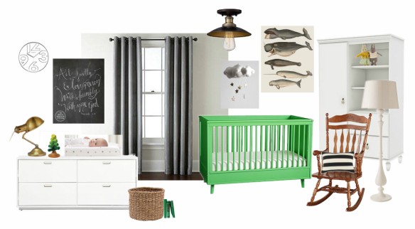
The walls will be a medium gray with darker velvet curtains. The crib that we have (a curvy Jenny Lind-style one, not as modern as the one pictured) will be painted Kelly green, and I will incorporate a mix of white, wood tones, metals and, maybe if I get really crazy, some cute little Narwhals.
This brings me back to gray, the first step to transforming this room in my head to a room in real life. I went to Home Depot and picked up a million swatches of gray. I was super-leery of any that looked blue-ish or green-ish. This would be the third time I have painted a room gray and I really wanted it to be the best gray room yet.
I compared swatches, brought them home, taped them to the wall to see how they caught the light, compared swatches again, decided what gray I wanted, consulted my husband, changed my mind on what gray I would use, talked about it more, prayed about it and then finally headed back to Big Orange to get my gallon of paint. I settled on a Martha Stewart color—Bedford Gray—and was pretty confident it would be the one. I bought it in the Glidden Duo brand with the paint and primer together.
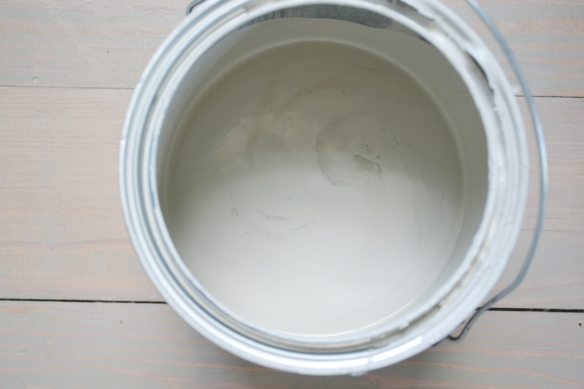
So let me just say, THIS GRAY IS AMAZING. It’s the gray of my dreams. For me, in this room (‘cause ya know, gray can change depending on the light) it was exactly what I was envisioning. AND, I would also like to add that the Valspar paint with primer is so smooth and so worth it. I barely did a second coat—just a few touch ups. I LOVE THIS GRAY PAINT!!!
I realized the key to picking the perfect gray (IMHO) is finding one with a little brown/taupe in it. The brown tones down any strange blues and greens but won’t look brown once the color is on the wall. The Bedford Gray that I chose went on light and more taupe at first and then dried the most beautiful shade of medium gray. I seriously want every room in my house AND my exterior to be painted this color. We are re-siding our house soon so the exterior part MIGHT just happen 🙂
Just to wrap it all up, here’s a little check-list when going to the store for gray:
- Go a few days before you plan to paint the walls so you have time to compare paints chips and decide.
- Pick tons of swatches, from all different brands, tints and shades. They are free so get them all!
- Come home and tape some favorites against the trim in your room in an area that gets decent natural lighting. Let them hang out for awhile as you get used to your options.
- Come back when the lighting has darkened some in the room and assess your choices. Star your favorites.
- Come back when the lighting is bright again and move the swatches to another part of the room to see if your favorites still make the cut.
- Remember to try to avoid ones with purple or green undertones, and when compared side-by-side, find one with a little more brown than the next.
- Ask advice from someone you live with.
- Take a deep breath and go buy your paint.
Or scratch all that and just choose Bedford Gray by Martha Stewart 😉 Maybe get a sample first—but really—if you’re room gets decent lighting (the room I used it in has two windows and is on the north east side of the house) it should be a pretty decent choice. I am in no way affiliated with Martha herself, but shoot, I just LOVE this color and am so happy how it turned out. Bedford Gray FTW!

One last tip I learned from a friend: if you feel the small swatches are hard to compare, buy a couple samples in the paint colors you think you may choose and paint a square of poster board as a large “swatch”. Once they dry, use those instead of the little chips from the store to get a better feel for the color against the wall. This is a more expensive option and could result in going back to the store a few more times to try different samples but may be worth it to you. I almost NEVER pick the top three choices I like at the store, and this time ended up picking one I was hardly eyeing at first, so this method would have been tricky for me this time but I still think it’s a great tip.
There you have it. Gray is gorgeous; it warms up any room and matches all colors. You cannot go wrong with the concept of gray, but when gray becomes a reality in a room it can often be a disaster if your eye isn’t trained to pick the right color. I hope this little guide gives you some confidence next time you set out to choose the perfect gray!
Good luck and happy swatching!
Rachel
Thanks, Rachel for sharing. I know exactly what you mean about finding the right gray. I have ended up with purply looking walls that were intended to be gray. Great tips I will have to hold on to. And I have to mention that kelly green is my fav color this summer. I must find a way to bring it into my house somewhere. LOVE!
Have a good weekend, Moxies! Remember if you are needing to get out of the house this weekend, stop by and say hi to Rachel at the Vintage Made Fair in West Des Moines.


 I found this map print at the Lucky Star Market in Ames. It was done by the Red Door Press. I love the bit of vintage it adds to the space.